 guide
guide
Building Pages with the Visual Block Editor
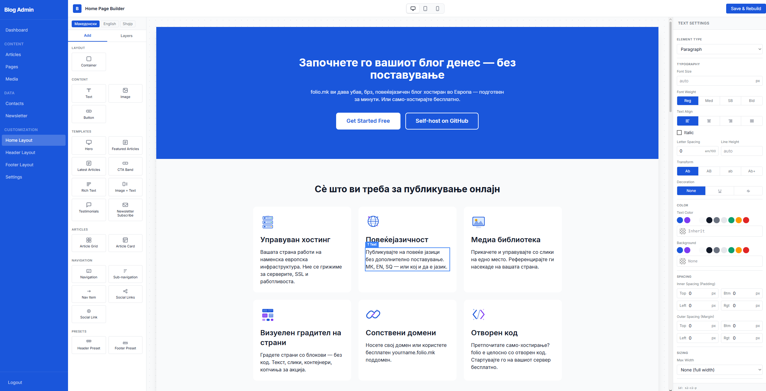
folio.mk's visual block editor is the engine behind every custom layout — the home page, standalone pages (like FAQ or About), the site header, and the footer. All four builders share the same three-panel interface: a block Palette on the left, a live Canvas in the centre, and an Inspector on the right.
The block palette
The palette is organised into five groups:
Layout — the Container block, which wraps other blocks and controls flex direction, gap, padding, alignment, background color, and responsive breakpoints.
Content — Text, Image, and Button blocks. These are the atomic building units you compose freely.
Templates — pre-built complex blocks: Hero, Featured Articles, Latest Articles, CTA Band, Rich Text, Image + Text, Testimonials, Newsletter Subscribe. Templates contain fixed internal structure but are fully configurable through the inspector.
Articles — Article Grid and Article Card blocks for custom article listing layouts.
Navigation — Nav blocks used primarily in the header and footer builders.
To add a block, either drag it from the palette onto the canvas or click it to append it to the current selection.
Templates vs. building blocks
The key difference is flexibility versus convenience. Building blocks (Container, Text, Image, Button) are blank canvases — you compose them freely to create any layout. A Text block is just a paragraph or heading; you decide the font size, weight, color, alignment, and spacing through the inspector fields.
Template blocks (Hero, CTA Band, etc.) are pre-composed layouts with internal child blocks already in place. They are faster to add but have a fixed internal structure. You can still click child blocks individually to edit their text, images, and config — but you cannot freely rearrange the children the way you can in a bare Container.
Use templates when you want a standard section layout quickly. Use building blocks when you need a unique, custom arrangement.
The Inspector panel
Clicking any block on the canvas opens its inspector on the right. Different block types expose different controls:
Text — HTML tag, content, font size, weight, colour, alignment, line height, letter spacing, text transform, and spacing.
Image — source URL with media picker, alt text, width, aspect ratio, object fit, and border radius.
Button — label, URL, style (primary / secondary / outline), and target.
Container — direction, wrap, align items, justify content, gap, padding, background color, border, and border radius.
The Layers panel
Switch the left sidebar from Add to Layers. The Layers panel shows the full block tree as a collapsible hierarchy. You can click any row to select that block, toggle visibility with the eye icon, delete a block with the trash icon, or move a block up or down within its parent using the ↑ ↓ arrow buttons that appear on hover.
Viewport switcher and multilingual content
The three icons at the top centre (Desktop, Tablet, Mobile) resize the canvas to check your layout at every breakpoint. The language tabs at the top of the canvas area switch which language translation you are editing — the canvas re-renders live as you switch languages.