 Getting Started
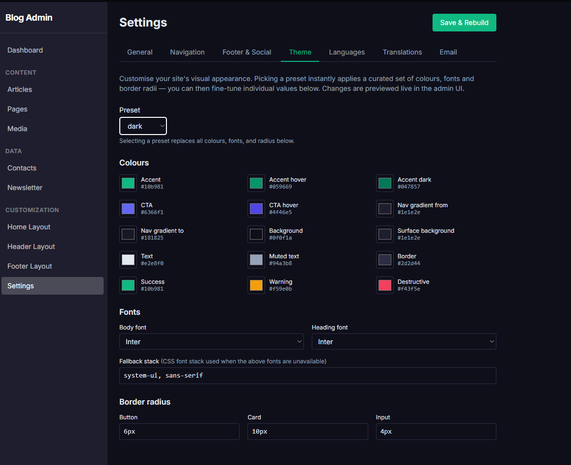
Customizing Your folio.mk Theme
folio.mk gives you complete visual control over your site's appearance through a point-and-click theme editor. You do not need to know CSS or edit any files. Every color, font, and border radius is configurable directly in the admin panel.
Choosing a preset
Navigate to Settings → Theme. At the top you will find a Preset drop-down with four built-in options:
Default — clean light theme with a blue accent (
#1a56db), white background, and Inter font.Dark — dark charcoal background with light text and a violet accent, ideal for technical or developer-focused sites.
Minimal — maximum whitespace, neutral palette, very subtle borders — lets your content speak for itself.
Warm — amber and terracotta tones, soft shadows, earthy feel for lifestyle or creative sites.
Selecting a preset instantly replaces all colour, font, and radius values below it. The admin UI updates live so you can preview the result before saving.
Fine-tuning individual colours
Below the preset selector you will find individual colour pickers for every design token:
Accent / Accent hover / Accent dark — the primary brand colour used for links, buttons, and highlights.
CTA / CTA hover — the call-to-action button colour used in hero sections and pricing cards.
Nav gradient from / to — the two stops of the header background gradient.
Background / Surface background — the page background and card/surface background.
Text / Muted text / Border — body copy, secondary text, and divider lines.
Success / Warning / Destructive — status indicator colours.
Click any colour swatch to open the native colour picker. The hex value is also editable as a text field if you want to paste an exact brand colour code.
Fonts
Under the Colours section you will find Body font and Heading font drop-downs. Available options include Inter, Roboto, Open Sans, Poppins, Montserrat, Playfair Display, Merriweather, and more. Select Custom… to enter any Google Font name manually.
A Fallback stack field lets you specify the CSS font stack used when the Google Font cannot load (for example: system-ui, sans-serif).
Border radius
The Border radius section has three fields — button, card, and input — that control how rounded UI elements look across your entire site. Set them to 0 for perfectly square edges or 9999px for fully pill-shaped buttons.
Applying your changes
When you are satisfied with the result, click the blue Save & Rebuild button at the top-right. The static site rebuilds and your new theme is live across all pages within seconds.